Locations
The end location needs to be inside and somewhere comfortable, like a living room or pub, this not only gives the players a chance to interact with the character on a personal level, but also gives them a chance to unwind and think about their day in a comfortable, easy going setting. They are also more likely to be friendly and talkative in this environment, so I would ask for feedback on the project; how they have enjoyed their day and what they feel they have gained from it. I am having a hard time figuring out where to place the clues and story giveaways for my project. All of the stories I have looked at about Coventry’s involvement in the first world war have been scattered all over the city, which would make it very difficult for people taking part to get from one location to the next. If people have to drive to a different location, it will completely take them away from the game and instead of walking through the city and looking at it in a new light, they would be looking it in the same way they would if driving home from work, or picking children up from school. They may also have more difficulty finding locations. It would completely take away from the magic of the journey, ironically. This does leave me with some tough decisions to make. Maybe the locations themselves do not need to be specifically associated with the First World War, but just with Coventry’s history as a whole. Then the story could still stay true to World War One. Another area of interest, which slightly links in with World War One was the London Black Taxi Cab factory, which would have been a good location, but as seen in the map below, this is too far a walking distance from the city centre to use as a location.
My project will be split into 4 different locations, these are Coventry Cathedral, the town gate, Coventry Transport Musuem and Whitefriars Pub.
Areas of Coventry that are of interest: Coventry Cathedral, The town gate, The Transport Museum and The Whitefriars pub.
At the first location, players will have an introduction to get them used to the project and familiar with how it is run, the information here will all be on readable formats, with hidden letters from our character Tom Willis, who will have wrote the letter to a loved one back home. The will be actual hidden letters around the location, which can be spotted by tokens. There will be 3 different parts to the letter that need discovering. At the second location, a QR code will link to an audio file. This file will be Tom talking through the letters about the World War. The next location will have photographs of Tom from different points in his life, 5 in total. These will go from his birth, to his time in the way and finally ending with him as an elderly gentleman. The third spot will have video clips of Tom, played on the Big Screen outside of Coventry Transport Museum, which will give details about the final location. To get the video to play, players will have to send a selfie to the hashtag discovercoventry, it will then be played on the big screen before the video. The final location will be the Whitefriars pub in Coventry. The character of Tom at the age of 20, wearing army gear will be at this location, where the story will end and players will have the chance to ask him questions about his time in the war.
Actors
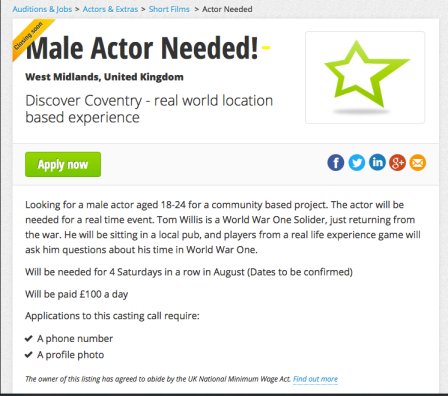
I really want my idea to be personal to those involved, and make it seem as if they are in touch with a real person, who has been through the world war, but I also want a video of Tom as an old man, to show how he reflects on his time in the war. I will put up a casting call on star now for older actors to take part in a short video piece, and also a young actor, playing a WW1 soldier, who the players will meet at the final location. I decided to use the young version of Tom int he final location as the experience will be fresh in the characters mind, it would also logistically make more sense as all soldiers from WW1 have now passed away.
Prototype of casting call for both Tom Willis’, male actors:
Experience
I have contacted Warwick Arts Centre, who are involved in the Fortnight project to see if I would be able to get some volunteer work during the project. Although the assignment will be over by then, I plan to carry on this project and release the finalised version by late August, given me a full 2 months to solidly work on it with no other distractions. The experience with Fortnight will be perfect for me to learn how other projects are carried out but instead of it being from a players point of view, I will be part of the team and can ask questions on how they went about finding ideas for locations and experiences, as well as funding. This is something that thoroughly excites me and cannot wait to get stuck in and start asking questions! Below are the emails confirming my volunteer work.
Posters
I am going to create a poster to display in public areas around the city of Coventry. This idea was bought to my attention when speaking with Fortnight, as they have done the same. The idea is that the poster will attract attention, but only enough to create a vague recognition of the product or brand. This will then lead to a trailer being played on social media sites and hopefully I will get a few radio spots to further promote the project. But the poster will be the thing that people will remember the most, as it is the first thing they saw about the project. To understand more about what type of poster I need to create, I did a quick google image search. As seen in the images below, event posters are very different to project posters.
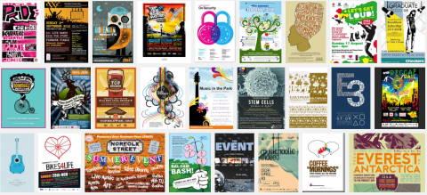
Event posters:
Project posters:
The main differences are seen in the text, colour and layout of the two posters. The text in event posters is minimal with only specific details like venue, time and date shown, whereas project posters are crammed with information about the project, what issues it is raising and why. Again, the colours contrast completely, with event posters being very vibrant and bold, and project posters being light and subtle. The layout is also very different, with a picture most prominent on the event posters and text taking centre stage on the project posters. After comparing the two, I definitely know I need to be creating an event poster and will look into these in more detail, specifically concentrating on my project area. My project is quite hard to condense into a few words, so this may get mixed results. I will look for game based events and community events.


I chose these three posters after looking on the internet as they are the ones that stood out to me the most, all for different reasons.

The first poster is actually advertising a company that make posters, so this was used as an example for a poster. It has so little information on it, it is very hard to ignore! The bright green colour catches your eye instantly, while the egg at the centre of the image gives the only bit of detail on what this poster might be advertising. I like the idea of having one central image that doesn’t give everything about the project away.
The second poster was for a exhibition for computer and video games. This poster stood out for the opposite reason of poster 1 in the fact that it was a dark bold colour. The E3 was big and made me want to find out what it stood for, much in the same way the egg in picture one did. It gave the relevant information like date, venue and project but left the rest out. It has a very game-like font, which obviously fits in well with the exhibition.
The third was a food event with mobile food vans giving out food. This was different to the previous 2 with the amount of text and the colours. It was black and white but still intrigued me by the way the words fit into the bus, which was the key feature of the event. I do feel however there are too many words, which is something I will take into consideration when creating my poster.
Looking at these three posters gave me the idea to use one key image on my poster, and centre the wording around this. This image needs to be significant to the First World War, which could be a gas mask, a boot, the Wipers Times paper format etc. It also made me think about which font to use to suggest what might be happening in my project. The font should be something that fits in with WW1 or could look hand written due to the amount of letters people sent home. I will draft a few paper version of different ideas before creating a digital version.
Above are three very rough sketches of poster designs. The first (incase you can’t tell what it is) is a World War One gas mask. The text would go over the mask and the mask would fill the poster, making it look as if it were staring at you from a distance. The second is a simpler design but something everyone associates with war: a poppy. The red of the poppy would stand out in contrast to the background of the image. The third photo was based on a design of a tank. Although this is the less obviously associate war image, I like how the text can be written in the vehicle, like the poster from above of the bus. I have asked a small group of people which of these images they like the best, with the majority of people felt the poppy was more thought provoking and striking on first glance, but the people suggesting this were women, so this may have influenced their decision. People then began to change their mind when looking at the gas mask picture, with it becoming clearer what it was and what it symbolised. They felt it would be striking from a distance and look like a face staring at you. They weren’t as keen on the third poster, as tanks weren’t invented until later in the war and the image wasn’t as clear. There suggestions made me think about creating a more coventry specific poster, with bullets or grenades on the cover, because of Coventry’s heavy involvement with the making of ammunition.
I asked a few of my peers what they thought of these fonts, with the majority of people preferring the second font (8 out of 11), because they felt it was more unique and “different to everything else I’ve seen.” People felt the type-writer fonts seemed “a bit too conventional.” Someone else commented that they liked the second font, but it didn’t feel very world war like. And another comment suggested that fonts 1 and 4 didn’t really fit the description. This has left me with the choice of font 2 or font 3. I really like font 2, but feel I would need to edit the 9 cents sign from the image, as my project is not American.
The above are two different designs from the same mask, I prefer the dirty, sketched look of the second image, but feel the text needs to be changed to font 3. This mask looks more like a Second World War mask though, I did try and look for a creative commons gas mask but they are very rare to find. I will use this as a prototype only, when creating an actual poster I will try to draw the mask myself, or will ask an art student to help me.
After playing with fonts and colours, I am much happier with the final poster. I will experiment with the poppy poster to try two different themes and see which people prefer.
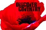
I quite like the image above because of its simplicity. The poppy is copyright free under a creative commons license, so on the finalised poster I will credit the photographer near the bottom of the poster. I decided on font 2 as it was so original and went so well with the poppy.
Most people I asked preferred the poppy poster, because it is a lot brighter and lighter, whereas the gas mask photo is very dark, which suggest the project will have dark connotations, which it doesn’t. I will be using the poppy poster when advertising my project.
Prototype of website:
I wanted to keep the website as simple as possible, with just a simple video placed on the home page of the trailer. This will still keep viewers interested, whilst not giving too much away. I feel the poster will give enough away about the project. This idea came from Fortnights website:
Things left to do
- Make a character profiles for Tom Willis’:
Character profile Tom Willis (78)
Character profiles Tom Willis (18)
- Make a sound script for the audio files:
- Make a video script for the video files:
- Make the letters, (laminated)
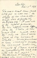
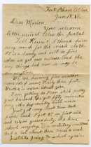
- These are sample letters, which will help me when creating the real letters.
- Tokens for players to find:
This token will be shown at locations involved in the game, they will also help in finding the clues to the story. This token will be laminated.
- Contact the Big Screen to see if they would agree to play my video, which, if applying for the heritage fund they may be more willing to help.
Pre Visuals of locations:
This project will be run for a few hours at the weekend. I felt having it only run for a day, instead of people coming back over a longer time period will allow them to fully immerse in the project at one given time, and it eliminates the risk of them not returning the following week. Having said this, the project will be run over a period of a month, but the project will be the same each weekend for 4 weeks. Only 3 different groups can take part in the project and need to book in advance via the website. They will pay a small fee of £5 per person and groups can be no bigger then 5 people. The reason for the fee is to cover acting costs, printing costs and prop costs. This fee will be taken out if I can get funding from the Heritage Lottery fund.
Geeky Swedes. (2010). “BURP” A new community event. Available: http://www.myballard.com/2010/04/20/burp-a-new-community-event-on-may-1/. Last accessed 22nd Feb 2014.
Minuteman Press. (2014). Print problem solved. Available: http://minutemankent.wordpress.com. Last accessed 22nd Feb 2014.
http://www.dafont.com/old-press.font?text=Discover+Coventry. Last accessed 1st March 2014
http://www.dafont.com/buy-more.font?text=Discover+Coventry. Last accessed 1st March 2014
http://www.dafont.com/1942-report.font?text=Discover+Coventry. Last accessed 1st March 2014
http://www.dafont.com/veteran-typewriter.font?text=Discover+Coventry. Last accessed 1st March 2014
http://www.ehow.com/how_5092912_draw-gas-mask.html. Last accessed 1st March 2014
http://www.flickr.com/photos/aigle_dore/6906665986/sizes/l/. Last accessed 1st March 2014
http://2.bp.blogspot.com/_v1l24hLE2pQ/S-m1leIR2iI/AAAAAAAAEhE/-PwLaQk6K_w/s1600/Letter1.jpg. Last accessed 3rd March 2014
http://www.coventry.gov.uk/contact. Last accessed 3rd March 2014
http://www.bbc.co.uk/bigscreens/. Last accessed 3rd March 2014


